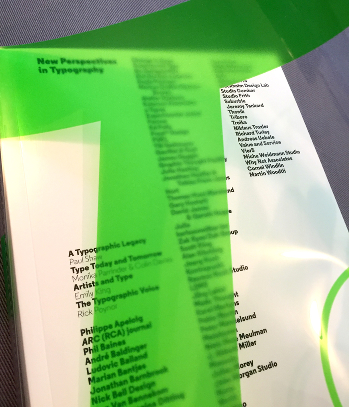


“New Perspectives in Typography” is a beautifully diverse and refreshingly current collection of the best typography-focused design from international design firms, foundries, publications and everything in between. The title pretty much captures the contents of the book compiled by A2/SW/HK’s Scott Williams and Henrik Kubel. (In addition, the cover design that wraps around the entire softcover book is just as beautifully considered, as are the contents within!) Starting with an in-depth historical review by typophile Paul Shaw, and followed by exploratory essays of the future of typography, artistic perspectives and communications (with Introduction by Rick Poynor), this book succeeds on so many levels. It is a broad collection of all sides of typography, from simple minimal brand design to experimental graphic interpretations. It is a pictorial documentation of how diverse typographic language and media can be expressed, and it is a selection of short bios & case studies from designers who happily break down convention and rebuild type communications. It is also encouraging evidence that typography—whether it be existing fonts or custom type—is growing vibrantly, ever-changing, accessible, and inspiring to all designers past, present and future. This book is a welcome addition to the usual typography textbooks and recommended reading from seasoned design educators. 5/5 STARS (*Note: the book IS full-color, I just happened to select images that were primarily B&W.)
Blog


Books play a big role in my life, especially ones that inspire, induce jealousy or teach. Some designers refuse to look at ANY design books at all (fear of unintentionally ripping off work?—agreed, plagiarism is nobody's friend). My purpose is to be aware of certain trends, to give myself that badly needed kick in the pants when I see brilliant work, and simply because I never want to stop learning and doing new things. I thrive pushing myself beyond my comfort zone. So it's no surprise in grade school, when my teacher wrote in my report card: NANCY GETS BORED EASY. What the heck? Aw, but it's true, I do.
That being said, these are probably my most highly anticipated, engrossing and recommended books to come my way this year and I wanted to share them with you as soon as I finished reading them:
_______
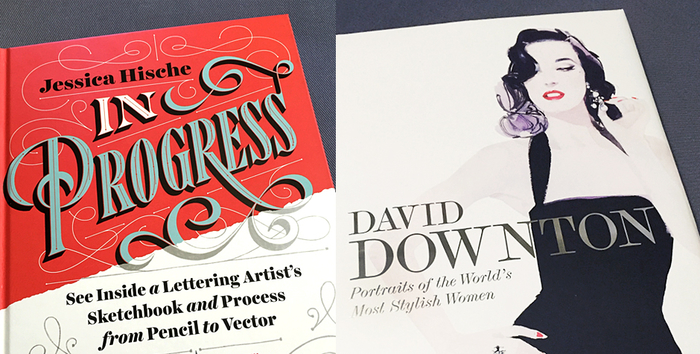
JESSICA HISCHE / In Progress: See Inside a Lettering Artist's Sketchbook and Process, from Pencil to Vector
Let me start with the fact that I can’t love this book more than I already do and am giving it 5 stars with 2 thumbs way up. Jessica Hische has taken practically (I’ll come back to that word again later) everything she knows about lettering and typography and put it into this book. “In Progress” is distinctive from other books written by designers merely showing off their work. It gives equal weight to process development as well as final product, as she shares her thoughts and guidance along the way. It's definitely Jessica's own voice coming through in an intimate conversational way, like one-on-one mentoring. She shares her design history in great detail without arrogance or dryness, and is practical in the flow of writing and content. She is frank, passionate and thoughtful about her process that it's hard to find any fault at something that is achievable IF like Jessica, you really push yourself and over-deliver. There's plenty of WHAT and HOW, but more importantly, more of the WHYs, explained with clarity, confidence and encouragement. This is particularly valuable for novice letterers who feel intimated at the prospect of taking the handlettering plunge. Take this example of RESEARCH & BRAINSTORMING: "Proper research alleviates a lot of anxiety at the start of a project—the more confident you are in your understanding of the subject matter, the less worried you will be about your ability to come up with solid concepts.”
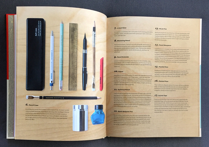
This 176-pg hardcover book is beautifully designed, and well-considered in her approach of each spread. (Although there are some stray typos throughout and a shame there isn't a type colophon for the fonts used). I would often take a break to research things online that she discussed: her work samples, digital tools, drawing materials—wow I haven't used a pencil extender since art school, gee I wonder where you buy those now....just a minute....see what I mean? The preface also has a lovely intimacy, written by Jessica's previous employer before she went solo, the equally gifted designer Louise Fili.
This is the modern designer's essential lettering book without the stale, verbosely dry content of old academia or the numerous pages and pages of baseline templates that suggest endless hours of generic calligraphic practice. Jessica has succeeded in creating the satisfying kind of book that is a reflection of who she truly is. Overflowing with dedication to her craft, high standards and infectious passion for type design. Definitely a keeper.
_______
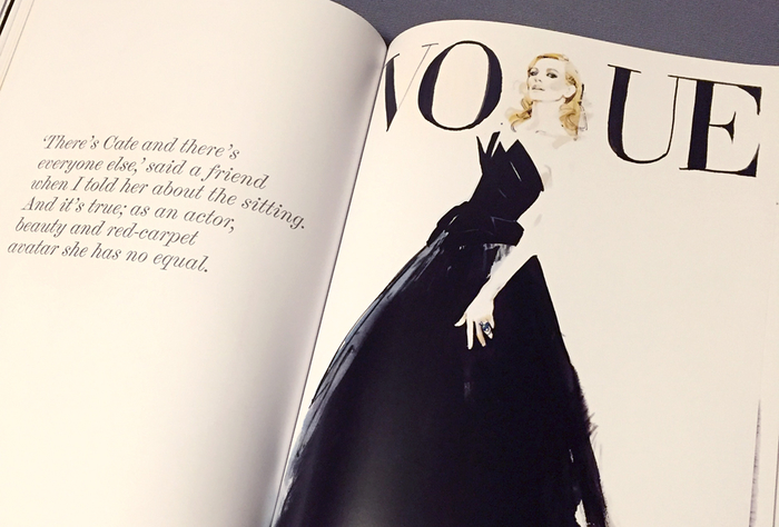
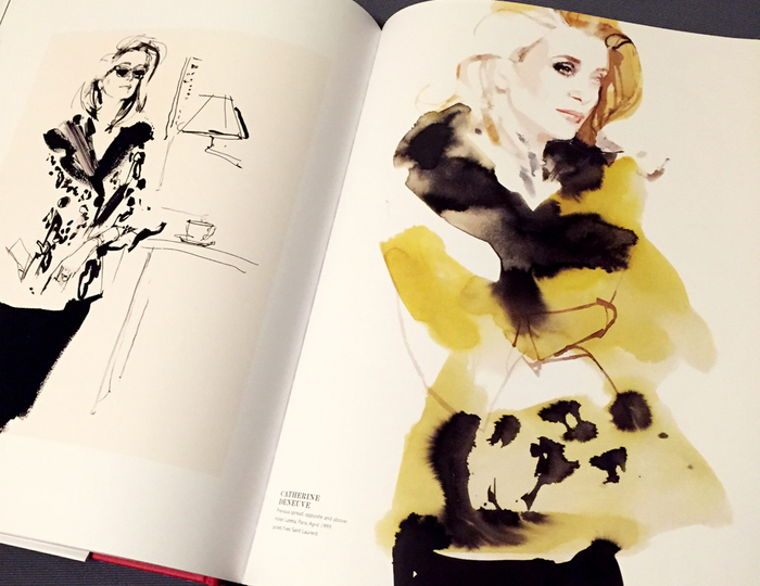
DAVID DOWNTON / Portraits of the World's Most Stylish Women
Stunning. Captivating. Sensual. Distinctive. Stylish. Words alone can’t describe David Downton’s exquisite illustrations, nor the majestic muses who make up this sumptuous collection of over 150 portraits of the world’s most beautiful women. Distinctive, contemporary beauties such as Dita Von Teese, Cate Blanchett and Linda Evangelista to timeless icons like Catherine Deneuve, Charlotte Rampling and Carmen Dell’Orefice grace the pages of this elegantly designed and appropriately large-format monograph.
Downton is the world’s preeminent fashion illustrator for over 15 years, and recognized internationally for his work with Vanity Fair, Harper’s Bazaar, Vogue, Chanel, Tiffany’s New York, Harrods, Lancome & the V&A Museum. What sets his distinctive portraits apart is his ability to accurately translate the depth of beauty and soul of each of his female subjects with an economy of line deftly executed with brush, ink, pen and hints of graphite or charcoal. Every line, mark, stroke and shade of color is deliberate, while spontaneous at the same time. There’s a graphic abstraction found in his work where calculated, textural brushstrokes and the interplay between positive & negative space invite the eye to linger and explore every detail. This modern quality found in his compositions is equally embraced and uniquely executed in his own right, while thematically reminiscent of 1920’s fashion-forward illustrator, J.C. Leyendecker.
Sprinkled throughout this book are his personal written recollections of working with each icon, as well as documentary style B&W photography with his subjects. It concludes with a section printed on vellum stock of his exploratory sketches. With a foreword by Christian Lacroix and an afterword by Dita Von Teese, this collection is as much a celebration of his hugely successful career, as it is a masterclass study of an art form that is matchless to conventional photography. I am grateful to have discovered David's work, and anticipate more collections like this to follow, as he has no signs of slowing down as his Instagram feeds attest to.


This summer has been far from boring with an inspiring Japan adventure (well-documented on my Instagram feed), a bunch of new projects completed and others still in production or under wraps. In the meantime, there's always some great reading to be had and here are two excellent design books worth sharing!
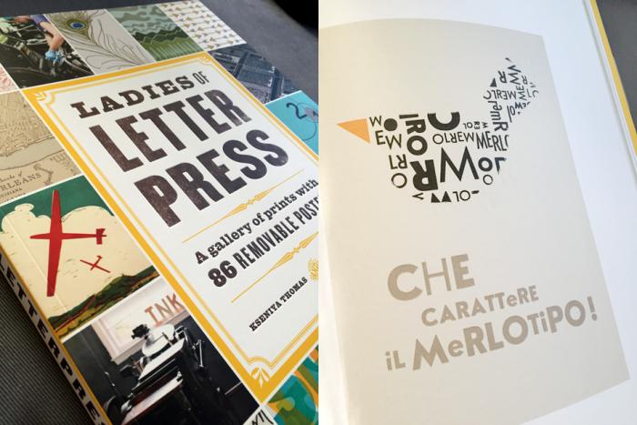
Letterpress has historically been a male-dominated art form concentrated on a combination of paper, ink, wood or metal-cast type and heavy mechanical printing presses (with much of the dirty, laborious post-environmental print work maintained by hand). A new generation has continued with those same kind of machines, using modern technologies of polymer plates in tandem with digital software, and led by a younger, female leadership. Ladies of Letterpress by Kseniya Thomas & Jessica C. White (Princeton Architectural Press), is a stunning collection and celebration of the best letterpress art, illustration & design from members of an international organization championing the work of women printers (whose name adorns this book’s title). Packed in 11” x 14” space, complete with 86 removable posters, this high quality book serves to inform and inspire with detailed letterpress reproductions in all its numerous forms. From the typical broadside poster designs, to invitations, packaging, business cards, coasters, and gift tags, the almost 200-pages of printed delights definitely proves that print design is FAR from dead, and that crafts(wo)manship is very much alive and keeping very well.
Each page features a single opening piece followed by a selection of works from a particular designer/print studio, accompanied by lively personal bios and a complete set of specs for each piece (print size, paper stock, type of press and number of colors). In-depth interviews are sprinkled throughout, sharing the motivations and challenges that attract these ladies to the letterpress world. Some personal favorites include work from US designer/educator/printmaker Joey Hannaford (of whom I had the pleasure of taking her lettering workshop at Typecon 2010) and unique pieces from Australian, Italian & Dutch designers. I’ve enjoyed reading many books about letterpress print design in recent years, but not one so consistently strong throughout, and one that utilized size and textural reproduction details so well. I don’t have to squint to take notice of all the textural nuances of letterpress, various printing techniques are clearly explained and demonstrated graphically (e.g. translucent layers of color create depth & tonal mixes), and I can practically smell the printing ink as I flip through. A great resource and visual celebration of what makes these ladies so passionate about print in the first place. Highly recommended and long overdue. I look forward to the 2nd edition! (4/5 stars)
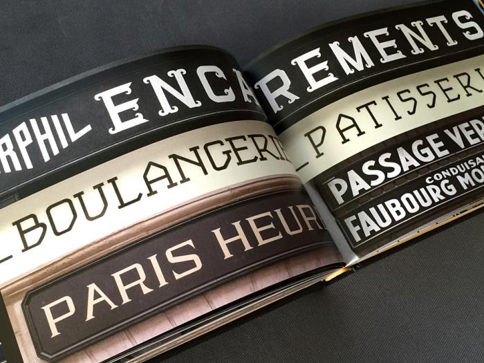
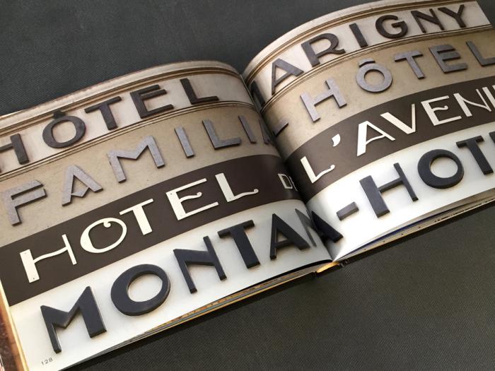
Graphique de la Rue (Princeton Architectural Press) comes from the well-travelled and decorative design eyes of New York-based Louise Fili. As lovingly shared in the book's Introduction, she has diligently travelled throughout Europe over the past 40 years, with camera and tripod in tow, passionately building a visual archive of dimensional, carved and painted typography crafted on 20th-century buildings and older. Previous books devoted to Script, Shadow, Stencil (these first three co-authored with her equally talented art director/author husband, Steven Heller), Italian (“Grafica Della Strada: The Signs of Italy”) and now French typography provide a vast historical document of lettering in all its forms.
Elegant gold-left scripts, classic neon, intricately colourful mosaics, to molded metal and carved into stone, the range of works—many created by hand—are endlessly vast and breathtaking. The book design itself, is equally crafted and elegantly designed by Fili and her team of super-talented designers including Spencer Charles & wife Kelly Thorn (who also illustrated the gorgeous cover!) and Nicholas Misani. Each section is broken into categories (e.g. Scripts, Mosaics, Art Deco) with its own introduction (meticulously researched, one would assume) that is equal parts art history lesson, French class and travel guide or walking type tour commentary. The book concludes with a brilliant listing of every photo name and location address, some additional photos with larger crops and extra background notes about the building’s history, facade or neighbourhood. A lovely bonus as a result of Louise’s numerous trips, are a few before and after images of signage that ended up changing with new ownership or replacement parts—and rarely for the better.
Anonymous and credited authorship, in celebrated as well as obscure architectural facades make up the library of images and proves to be a most valuable and inspirational source of cultural and historical typographic forms. If only every country could have the honour of rich pictorial documents such as this! (5/5 stars)
------
Next on my reading list is the highly-anticipated debut by Jessica Hische, "In Progress: See Inside a Lettering Artist's Sketchbook and Process from Pencil to Vector" (Chronicle Books) that I am absolutely drooling over! Full of her beautiful pencil sketches, Jessica walks readers through her process of designing with handdrawn type, including the tools, techniques and creative rationale behind some of her biggest profile projects (Wes Anderson, NPR & Starbucks). Flipping through my copy, I would already want to give it a 5/5, but in all fairness I must read it cover to cover, as I do all my recommended reading. :-) So until next time, keep reading & keep creative!


At the age of 8, I became a HUGE Abba fan. I saw them live in concert, and faithfully listened to every song on every album in chronological order, focussing on different details each time. Sometimes the vocals only, sometimes certain instruments. Each song detail was burned in my brain. It wasn’t until 1994 when I experienced another side of them with their first box set. It was the rare track called “Abba Undeleted,” a 23-minute medley of unreleased, incomplete and rough versions interspersed with studio chatter. With headphones on, I heard laughter (with the girls mimicking parrots), relaxed experimentation and musical bites hinting to familiar songs. I also figured out why certain parts that were great on their own were cut, as they didn’t really go anywhere. While these outtakes might be considered insignificant, useless, or off-limits to the public, it’s these outtakes that reveal more below the surface. Things like a softer approach, one area more developed than the other, or something so unpolished at first, yet a gem nevertheless. Thus, the reason why artists shouldn’t self-edit too early for fear that some jewels never get discovered, or remain forever buried.
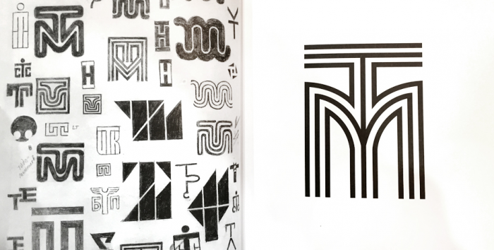
Typographers and graphic designers have outtakes, but not all come to light in comprehensive retrospectives from masters like Marian Bantjes, Philippe Apeloig or Stefan Kanchev.* Not all designers have rough sketches as tight as Kanchev's, but these roughs are a key part of the creative process that’s worth a closer look. You see thought process (sometimes demonstrating one idea bleeding into another), how certain themes recur in different graphic forms, or how the entire thread of a design came to fruition. Had one stopped or settled at a certain point, it might have never had the chance to grow and blossom into something stronger, thoroughly refined and bulletproof to regrets.
Although I developed my skill of brisk and plentiful sketching from experience and practice, variations of an idea or a theme isn’t new by any means. Writers have taken side trips with their own manuscripts, working out other endings, or venturing into character introspection. Actors and directors have explored alternate takes and prequels to explain how a character’s background affected their journeys later in life (sometimes necessary, sometimes convoluted—yes, you, Mad Men & George Lucas!). Of course, music has also offered up stylistic variations, different lyrics or endless remixes. These extras are often archived away, to be reserved later for diehard fans, but some may appreciate them on their own merit. Some questions arise: do these alternate explorations work for the greater whole, and are outtakes really that necessary?
I say, absolutely. There’s something beautiful and honest about not being held back by technology, judgement, time or project constraints. Being free and open with experimentation can lead to new discoveries, opportunities to challenge further, better outcomes and visual clarity. The importance of sketching can’t be emphasized enough, as it helps designers and creative thinkers to get thoughts down quickly and to explore the “what-ifs”. That means trying ideas over and over again until it’s either proven a dead end, or having a breakthrough epiphany that results in the adage, “nothing ventured, nothing gained.” This method can be trying at times, but having the maturity to know a great idea may not always be appropriate for the current task, is par of the course. Sometimes it’s also worth taking a break and revisiting with fresh eyes to give a new slant on things, leading to that diamond in the rough. Alternately, some designers “sketch” or develop designs on screen, and treat their mouse or finger as much of a drawing tool as a pen or pencil. Digital proficiencies alone could never replace the germ of a good idea or the speed of documenting it on paper, yet composing on computer armed with a concept or two, can expedite tighter variations while building an archive of design iterations.
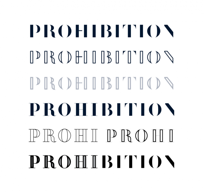
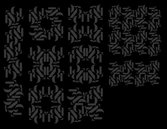
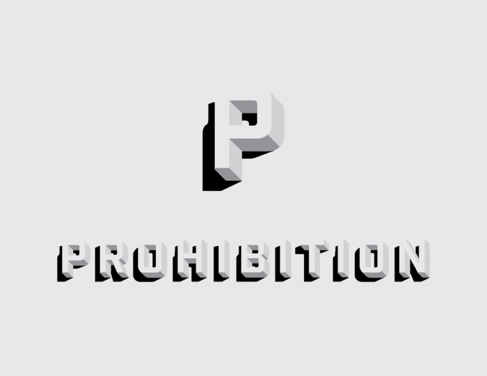
I’m happy to share some outtakes from our recent brand design project for Prohibition at Rosewood Hotel Georgia. A 3-week period of research and intensive design development helped Johnathon Vaughn Strebly (my design partner on this assignment) and I to reach a very successful outcome for our clients. Starting with typography inspired by the tradition and heritage of a past era, it evolves into stylish, partial letterforms building on a sense of mystique. Color palettes were initiated from the interior designer’s moodboard to appropriately bridge the vintage with the modern, and classic elegance with modern sophistication. The florette graphic was a “what-if” experiment, where I took the logotype's individual curved shapes in an attempt to create a typocentric mark. This graphic reflects the theatrics of live musical performances, the energy of group celebrations and the mixology aspect of ingredients, flavours and bespoke drinks. Whether used as a single graphic entity or as a connective pattern, the visual impact was striking even in early design iterations. Exploring a range of graphic directions within real-world applications was also an invaluable way to show the flexibility of the design system, as well as any challenges or consistencies in the overall communication design. Finally, there are some routes not taken that may validate a creative opportunity; in this case, to demonstrate a vintage stylistic take on the theme of "half seen, half hidden.” We enjoyed this direction for its simplicity and visual wit, yet acknowledged the unanimous strength by which the final brand identity best tells the story of Prohibition.
Sharing and talking about outtakes also serves to demystify the roles of experienced graphic designers and their process. It is not simply the first idea that comes out of thin air and selected for the spotlight where comprehensive brand identities are concerned, as a logo by itself is not the brand. The components to create the brand image or character for a given audience include typography, colour and language (both in words & visuals) as well as applications to stationery, print, signage, advertising, packaging, clothing or websites that express the fuller breadth and emotional qualities of that identity. The brand story also takes time to develop, just as much as the design applications for that brand need to be true to the spirit and conceptual thread carried through every touchpoint for audiences to see, understand and embrace. So while outtakes don’t always reach the finish line, it is those outtakes that help designers to get there successfully.
----
* OUTTAKE FROM THIS BLOG ARTICLE:
Hailing from Bulgaria, Kanchev was quite prolific in his logo design career from 1945 to 1988, drawing logos completely by hand before computers became the norm. His “Logo Book” collection, lovingly compiled and designed by Magdalina Stancheva in 2012, feature many of his uber-tight sketches that are almost as exquisite and well-considered as his finished works.
----

After a LONG blog drought—while steadily working on a bunch of design projects, so hardly lazy—I accepted the fact that I wasn’t as diligent with postings as I wanted to be. I will post when I can commit to a more dedicated schedule or when I have something worth sharing. I happened upon a quiet moment today however, to reflect on what it is that gets me inspired.
Some people swear by NEVER looking at design blogs, books or magazines. I suppose there is a certain kind of sponging that happens when your eyes & brain become the repository of all you’ve seen on Instagram, Facebook, Tumblr, or a combination thereof. Yet I do think it’s important to know designwise what is trending (both good and bad), as well as to confirm initial ideas had been already done. I sometimes use Pinterest to show clients that a particular style isn't original as once thought. I also find that jealousy can be a great motivator—from the whiny, “Awww, I wanted to do that!” to the empowering, “I AM going to create something as brilliant as that!” The key, though, isn’t in what you merely see, but in finding meaning in it…a sound concept or idea, not merely a style. Discerning clients are smart and rely on designers and creative directors to translate visual language into communications that are intelligent, tangible and relevant to their business or service models.
So back to the question…what inspires me towards effective design solutions? There is the jumpstart from a robust briefing document with background history and project requirements, as well as from the research that follows. Both this jumpstart and other things I’ve been reading or thinking about at the time bring a wealth of visual ideas to mind. However, 2 key triggers of inspiration are CURIOSITY and CONNECTIONS. I’m always curious about everything around me and ask questions about why and how, or even “What if…?" Especially with new clients, I welcome the opportunity to learn new things and to understand their world better…whether something totally foreign to me, like saw blades or absinthe, or something VERY relatable, like handlettering or digital printing. Connections also exercise my mind, as I find meaningful threads or parallel themes in something. I’ll admit, this is a skill I developed from watching endless foreign language arthouse films (what the heck does that old lady with the recycling bin mean?) or Gordon Ramsay’s Kitchen Nightmares (seeing how flaws in a restaurant’s ownership or staffing connects to troubleshooting operation flaws or communication challenges). Even TV cooking competitions have taught me many important lessons: presentation, taking (good) risks, overdelivering to impress or to demonstrate potential, and what I call “Butter Chicken Poutine”: don't make what you think people expect. Make what you'd like yourself and know could work well memorably.
I’ve also been finding inspiration in independent design-related publications that have been providing different perspectives on creativity. These are sometimes pricey as a tradeoff for quality printing, premium paper stock and the absence of (or tasteful limit of) outsider ads, but many offer more affordable and immediately downloadable digital options. The personal connections and engrossing curiosities met through a variety of people and their stories are encouraging and worth sharing:
Monotype has relaunched THE RECORDER Magazine, a type industry magazine that had been in circulation for around 70 years. I was enthused by the thickness, variety of subject matter and captivating visuals (designed by Luke Tonge) that explore ghost type, letterpress printing, identity design based on a massive dot matrix, book reviews, etc. After reading it cover to cover, I found that while graphically stunning in its archival nature, not all of its content is equally strong as the next. For example, a feature on Berlin’s first typographic concept store & gallery is supported by sparse imagery, underwhelming in comparison to the text. Nevertheless, the vast range of international coverage available to the editorial team brings great potential towards a surer footing in the next edition.
Another magazine I’m quite enjoying is the aspirational THE GREAT DISCONTENT. Named after their popular website focusing on beginnings, creativity and risk, New York-based Ryan & Tina Essmaker initiated their print & digital publication through Kickstarter support with the refined design eye of Frank Chimero. Full of interviews with creative people from graphic designers to photographers, illustrators and a myriad of combinations thereof, reading this magazine is like having an intimate, honest conversation with likeminded folks who embrace and find joy in their current creative lives. It’s not about striving for career success in the "next big thing" as much as it is about keeping their souls full and alive with passion, authenticity and bravado in whatever they’ve done, and will continue with on their life’s journey. The 2nd issue was released early this year, with upcoming plans for a quarterly run.
Each issue of the beautifully designed OFFSCREEN (published, edited & designed in Australia by Kai Brach, printed & shipped out of Germany) explores stories about the people behind bits and pixels….in print. Currently not available in digital format—and presumably never will, like Monocle Magazine—this limited edition publication celebrates the balance of digital life of designers, web & app developers, problem solvers and entrepreneurial types. Meant to be read offline in a distraction-free environment, this magazine is a proponent of The Slow Web, the idea that not all that is instant or fast is necessarily good for us. I think that in itself is pretty inspiring. Launched in early 2012, they’re now at issue #10 (the first 6 issues now out of print).
LAGOM (a Swedish word meaning "just the right amount”) is co-founded by UK-based 8 Faces creator, Elliot Jay Stocks (who was responsible for the 8-issue run of one of the first independent typography magazines), and has a lifestyle focus on innovation and creativity. As with the rest of these indie publications, the photography style and narrative is visually engrossing and personal. It's a celebration of creative people, but not entirely what you may expect. Some are directly related to design agencies, while others are beekeepers working above creative offices. Who knew? Their 2nd issue was just released today in print and PDF format, with an iPad edition to come.
FIVE SIMPLE STEPS also comes from the UK with a unique offering of individual or set-based mini faux-kraft books that are easily digestible (quick reads, not quick eats). Primarily focused on subjects related to web design, these little books went the reverse route with e-books designed to look like real books that were eventually adapted to print from digital…still with me here? They went through a little hiccup when original publishers, Mark & Emma Boulton, decided to pursue other interests, but thankfully new owners, Craig & Amie Lockwood, came in to save the day and resurrect this fine series.
My best for last are two publications I can’t express my love for enough. The A BOOK APART series (13 books plus a couple 2nd edition updates), evolved from the brilliant web design-focused website, AListApart.com, with my highest recommends for "On Web Typography" by co-founder Jason Santa Maria and "Design is a Job" by Mike Monteiro. His latest book, “You’re My Favorite Client” I have not yet read since buying it, but will probably love if it’s anything like his first one, which I will probably re-read every year.
UPPERCASE from Calgary, Alberta is tastefully curated, compiled, designed, art directed and managed by a modest, yet uber-talented dynamo, Janine Vangool. Now with it’s 25th issue about to go to print, this highly collectible, colourful, textural and image-filled publication celebrates the craft of creativity…from weavers, calligraphers, printmakers, painters, designers, typographers, textile designers, and everything else in between.
As active with her magazine as she is on social media and with regular e-newsletters, Janine is a reflection of everything that is right with independent publishers and creative people. Hard work, dedication, many long and late hours, financially taxing at times, but beyond a labor of love, it’s what they are compelled to do...for themselves first. And I guess that's the simple thing that inspires me in my design practice. It’s what I’m good at, what I’m regularly hired for, what I’ve always done and will hopefully always want to do until I am physically unable to. I’m compelled to do this.
“I have a curiosity that compels me to find ways to make music that are fresh and new.”
—The Edge
- ‹ previous
- 3 of 5
- next ›